The End
Today marked the end of the team channel brief that we had been presented with, me and the other members of the group presenting the finished product. The presentation had to be a minimum of ten minutes long which we complied with easily. Within the presentation we as a group discussed the stages in which we went through to get the finished product. We discussed how we had come up with our brand and our logo, how the video ideas had changed from being a purely comedy type videos to becoming more serious. Within the presentations we also described our roles within the team which where:
- Production manager - Jade Garstang
- Scriptwriter - Callum Sulsh
- Graphics - Oliver Evans
- Programmer - Liam Gorton
- Editor - Jake Fisher
- Camera and audio - Josh Hawes
When presenting the finished channel that we had created we showed the four videos that we had made and the website that had been created (These can been seen below). When showing this there was some problems. One of the problems that we faced is that the website was out of alignment due to the fact that it was not coded to change for the size that we where displaying it meaning that parts of the website such as the tab bar were out of place. This problem was dealt with, along with another problem which was that one of the videos was not exporting correctly, meaning that they were being displayed in a very low quality compared to the others. However despite these few mistakes, the feedback and the way the videos were received was largely positive and the only negative feedback that we received was feedback that we knew we would get and problems that we resolved before the hand in.
(Hoverboard video)
(Teleporting video)
(Time travel video)
(Portal video)
Website Screen shots
 |
| (Home page) |
 |
| (News Page) |
The above two images are screenshots from the webpage. From the screenshots you can see that a very simple layout and colour scheme has been used within the website. This is because we felt that if we kept the design simple then people's eyes would be drawn to the changing background, which we felt would be the one design feature that would help elevate the website in terms of look. Along with that the colour scheme was set as mainly white because we felt that the colour in its plainness completed the images in the background that are mainly quite dark.
When designing the website I also felt that there would be need for a footer, that can be seen in the first screenshot. I felt that this was needed because typically on most websites this is where people would go to find information such as contact details. Therefore as can be seen in the first screen shot I have incorporated a footer with different communication logos so that people would easily be able to contact us if needed.
Below is a screen shot of the contact page. This page admittedly was designed in a rush therefore it in my view does not look as good as the rest of the webpage. However despite that fact the page does serve its purpose, in that it has links to forms of social media that our brand is located on. Along with that it also has an email, which is created with PHP, that allows users to send in news stories if they have some.
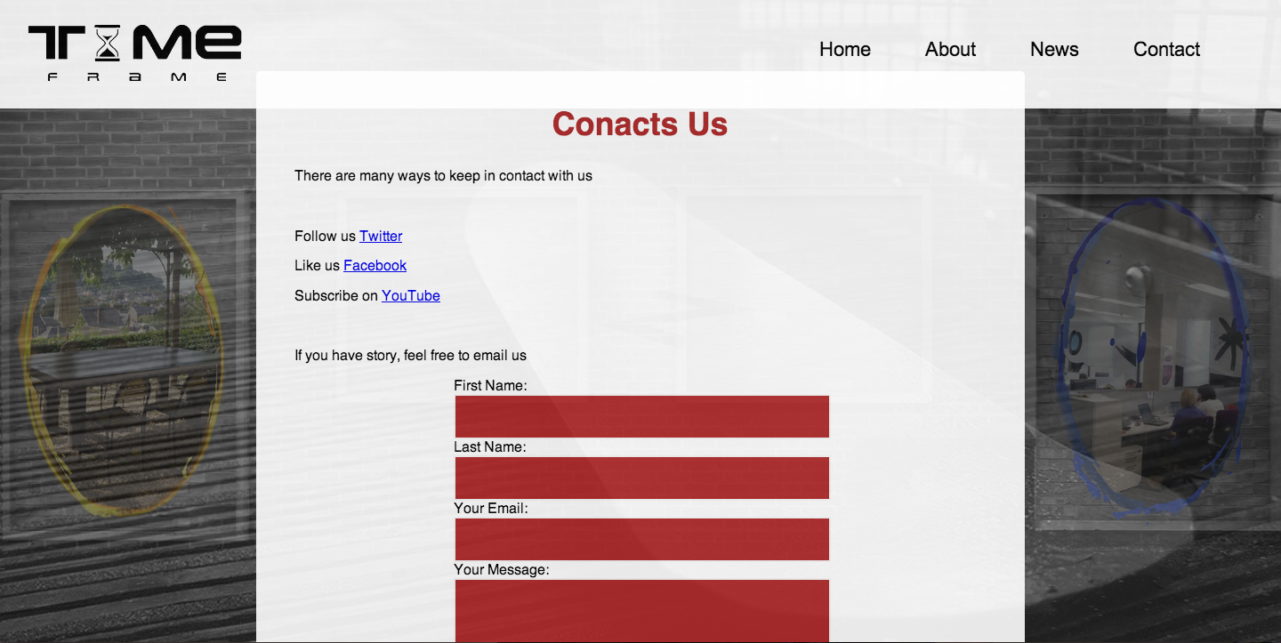 |
| (Contact Page) |
Ultimately I am happy with the way that the website turned out and functions, and the way in which the videos turn out as well. However I do think that there are areas which could have been improved.
No comments:
Post a Comment